Question 1
In what ways does your media product use, develop or challenge forms and conventions of real media products?
Music videos and genres have many conventions that record companies stick to in order to define their artist's star image. Some artists may choose to break and challenge these conventions as seen with Lady Gaga and other various singers. When creating our artist we had to assess the conventions associated with the genre we choose, Pop and Singer Songwriter. As a group we then had to assess if we wanted to stick to all the conventions or try develop them or completely go against the mould.
Stayed With Convention
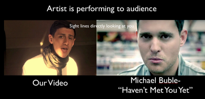
One convention of our genre, Pop Singer-Songwriter,is the use of close-up shots to emphasise the artist's face and image. Because Pop is so dominantly about the artist, their music videos will feature lots of close up shots of them performing and singing. We decided to use this in our music video as it we felt it was important that we established our artist. This close up also creates a relationship between the artist and the audience viewing it. It is almost as if our artist is performing to the audience which is what a lot of Pop music videos try to do, this is the Star Power theory by Richard Dyer.The connection is created mostly by the artist’s sight lines, their eyes are looking at the audience therefore creating the illusion that the artist is performing to the viewer. John Stewart’s theory on music videos states that music videos use a lot of “close ups and lighting to focus on the stars face”.We made use of this as you can see by having the close up and the natural light on his face and dark all around him.
Developed A Convention
Costume is a part of mise-en-scene and it is a convention for Singer-songwriters to be wearing quite nice designer clothes.Here we see Josh Groban wearing a black suit jacket and shirt. Josh Groban looks formal but there is a hint of informality as well with no tie and his collar undone.We decided to go against this convention and have our artist more casual yet slightly formal thus developing what Josh Groban has done in his video.We opted for the white shirt with black tie but no jacket. We also added the black scarf which could be our artist's motif.This motif adds to the structure of the star image, with the recurring image of our artist with the scarf on the audience can expect it from him and associate it with him.By having him more casual it attracts our audience as they can relate to this more independent look. Our main audience are females aged 12-21 and they can relate to this independence as teenagers are thrive on individuality and being able to do things their way, our artist ties in with this theme.
One convention of a Pop music video is the Mise-en-scene. Singer songwriters are generally shown in their music videos to be playing their instruments and singing in order to show their authenticity. Here we see in the picture Bruno Mars playing an old upright piano in some sort of loft studio apartment. This is a grassroots approach which a lot of artists are using nowadays in order to be more independent. Mise-en-scene is an important factor of star image and is used in music videos to emphasise image. We decided to go against the Bruno Mars video and instead use a baby Grand piano to give our artist more a classier appearance. This is achieved through content signs of the image, a grand piano exerts a sense of class and wealth due to their price and formality. Music record labels invest a lot of money into a music video , the top companies can spend up to $500,000 on one video alone. Therefore we were limited by our budget which was £0 but we aimed to meet the high production values associated with a music video.


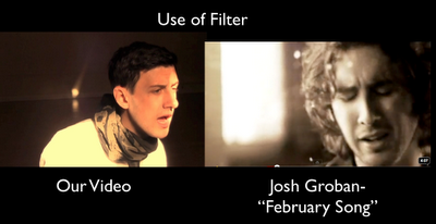
We took inspiration from various Pop music videos within our genre, we researched the conventions they stuck to and planned our music video upon these inspirations.One other convention of Pop music videos is the use of special effects and treatment signs. Many Pop videos like to use bright colours and flashing lights whereas the Singer Songwriters tend to use more toned down effects such as colour filters like Black and White. The point of using SFX is to make the music video more interesting for the audience and to enhance the performance of the artist. Here we see Josh Groban's video using a Sepia filter to give it a more aged look to it. We decided that using a colour filter for our video was a good choice as it gave the film a different vibe and so we went with a pale orange Sepia like filter. As a group we felt sticking to this convention really made our video more authentic which would attract our audience. Instead of just using the natural colour , having a filter emphasises the different features of the performance. As we see in the picture, the grey light filter emphasises his facial features which is important to an artist’s image.

The use of a splitscreen effect in music videos can be seen in many Pop videos especially those that have a mix of narrative and performance. Here we see in the Daniel Powter video that they have used a splitscreen to compare the two narratives of the video. We follow a man and woman as they go about their normal week before finally meeting. We felt that we should use this effect in our music video but by showing the artist performing and one of our narratives. This shows the audience the artist is singing to the people in our narrative. This also links in with the idea that the artist is performing to the audience as they can relate to the narrative as well.We developed this convention and we think that it fits the genre perfectly. We feel this way because when viewing the video you cut between the performance and narrative whilst the split screen allows us to show both at the same time. Therefore it is more interesting as a music video as we are getting two performances at the same time in a sense. Looking at audience feedback,the majority enjoyed the narrative and the effects we used particularly this and the screenshot effect.

Question 2
How effective is the combination of your main product and ancillary texts?
We
decided to answer this question as a group with each of us giving our
intake on the question. We then uploaded this discussion onto YouTube
with a slideshow displaying screenshots from our music video and our
digipack.


Our ancillary texts are mainly linked with the same dress code(aviator glasses, cardigan) , same visual theme with the leaves and the grass. This is effective as it looks more visually authentic and it appeals to the customer. The leaves are a classic setting and it has worked before , therefore we feel that it was effective to use for our digipack theme.

Our digipack is also linked to our music video with the piano featuring on the Back Cover and the Disc cover. This is effective as it enhances our artist's image as being a singer songwriter who can play the piano and it gives him a classier look.

Question 3
What have you learnt from your audience feedback?
To answer this question, I have looked at our music video and clearly annotated the positive and negative feedback that we received on our video. We created questionnaires and surveys as well as asking friends and family to give feedback on our video. I have annotated the good feedback in green annotations whereas the negative feedback comments are in red.
Evaluation 3 on Prezi

We also emailed Nick Gardner who let us use his song, "Out of the Clouds" , about our video. He sent us this reply :

Question 4
How did you use media technologies in the construction and research , planning and evaluation stages?
To answer this question I filmed myself going through the various media technologies we used throughout the process of our coursework.


